USL Championship side Louisville City FC is one of the darlings of soccer in the United States. They won back-to-back USL titles in 2017 and 2018, while being runner-up this past season. In spring they’re opening their own stadium after playing at the local AAA baseball stadium. The stadium, with an expandable capacity of up to 14,000, will be one of the crown jewels of lower-level soccer in the United States.
Ahead of that move, the team announced a new logo and name on December 16th. While they would still formally be known as Louisville City FC, the name on the new logo changed to “Lou City FC” along with a drastic change in logo design.
LouCity Christens New Era with New Crest https://t.co/7Hs43cgTr8
— LouCity FC 🌟🌟 (@loucityfc) December 16, 2019
The excitement for the new name and logo was short-lived, however, and three days following the announcement the Club President issued a statement acknowledging negative comments and fan backlash. More than that, he took ownership of the decision saying they got it wrong and failed the fans. In the statement they also mentioned they would stop production on all upcoming merchandise that included the new logo.
A Statement from Louisville City FC President Brad Estes:
LINK: https://t.co/I626gv9DIP pic.twitter.com/cPnUD3zONt
— LouCity FC 🌟🌟 (@loucityfc) December 19, 2019
Then on January 7th came the big news. They announced they’d be reverting to their old logo for the upcoming 2020 season while they work with designers and supporters on getting the new crest right ahead of 2021. Famously, Leeds United recently did the same when they unveiled their new, more modern badge in 2018.
A lesson in fan and consumer feedback
The willingness of clubs like Louisville and Leeds to take heed to the feedback of their fans is worth noting – and praising. Fans are the lifeblood of any organization. Does that mean future collaborations between ownership / front offices and fans are in order? Maybe. Every case is certainly different, but when the feedback on change is so polarizing and one-sided it makes you think. If a team can build an equitable brand the community can connect with and take pride in, wholesale changes can lead to considerable blowback – just ask the Chicago Fire.
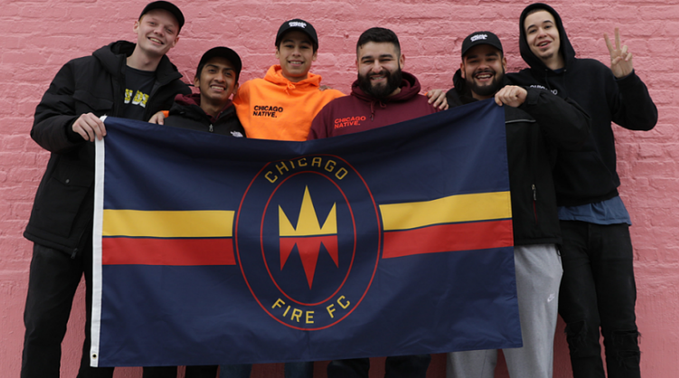
From new name to new colors and badge, the Fire unveiled major brand changes to coincide with their move back to downtown Chicago. With hopes of re-energizing the fanbase, the team was met with mostly negative feedback. However, unlike Louisville, the Chicago ownership team remains steadfast in their decision to rebrand as places around the city, like the Damen Blue Line stop, are draped in ads and decals celebrating the new Fire brand. For a club founded in 1998, relinquishing two decades of visual history in a nascent league is a huge decision. It will be interesting to see how fans respond once the seasons is officially underway – will they buy merchandise with the new logo? Of course the great equalizer is a good (and winning) product on the field, which is ultimately what the majority of fans care for most.
The Louisville and Chicago rebrand case studies are worth watching as we progress through the 2020 soccer season because they serve two very different examples of brand building. On one hand, Louisville listened to their fans and will revert back to the old logo for at least this season, while the Fire – who are in the midst of a complete franchise revitalization and fresh start – are full steam ahead on the new Chicago Fire FC brand.
What current soccer crest would GESM staff change?
In the spirit of collaboration, we posed this question to fellow GESM staff members. Which soccer crest would you like to change and why? Here’s what they had to say:
Mike: New England Revolution
It’s old and so… 1996. But there’s a level of beauty in it because, unlike some other older clubs, at least they’re sticking to their roots.
Jeremy: Inter Miami CF
I love the colors but it looks like they just copied a “badge best practices” manual with a badge inside a circle with the club’s name in Spanish and Roman numerals
Ubaldo: FC Juarez
Poor choice of colors, almost unrecognizable image of a horse in the center, and manages to make my head hurt every time I look at it.
Chris: Houston Dynamo
From the oddly-shaped crest, to the clip art soccer ball, to the busy-ness of the lines, it’s too busy and doesn’t really mean anything.
Categories: Uncategorized